Our Editors Get Political While Discussing the Best & Worst EURO 2020 Jerseys
'Beyond the Pitch' is a weeklong dive into all things football (read: soccer) in conjunction with UEFA EURO 2020, rescheduled from last year and kicking off June 11. Head here for more of our immersive coverage.
Finally. It’s Summer 2021 and Euro 2020 is here. Sound weird? Yeah, it’s been a weird 12 months... but all of that is behind us now, and — even if just for a month — we can focus on the football.
Most of the Euro 2020 jerseys have been officially unveiled for quite some time (we’re looking at you, North Macedonia, who only just unveiled its trio of kits), but with the tournament just days away, naturally, the football-mad contingent at Highsnobiety had to get together for another one of our famous roundtable discussions.
In case you’re unaware, we often like to get together (nowadays mostly on Zoom) to shoot the shit about a range of products. Everything from sunglasses to sandals and, now, football kits.
In this call, we dissected every single jersey that will be on show at Euro 2020, however, only the most interesting have made the cut below. Scroll on to find out what we’re loving, what we’re hating, and why.
The best, worst, and most WTF of Euro 2020 kits
Turkey
Graeme Campbell (Senior Features Editor): I think it's bold having the Swoosh in the middle. Looks good, though.
Matt Carter (Editorial Director): Having the crest there reflects the country’s strong man political landscape.
Fabian Gorsler (Sportswear & Sneaker Editor): I mean, just imagine that on a really muscular player — Yilmaz — skin-tight. Erdogan will be pleased.
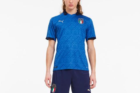
Italy
Fabian: It’s very regal.
Graeme: I hate gold on kits, but it works for Italy.
Jake Indiana (Senior Features Editor): Maybe the classic Italian tricolore is too on the nose, but something about this vapid expanse of blue feels like a huge wasted opportunity to me. Nothing about this says Italy or Italian pride.
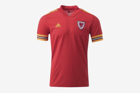
Wales
Graeme: Ronald McDonald FC.
Fabian: It's probably the worst one of the bunch for me.
Matt: The away shirt. What? They're basically Australia.
Switzerland
Fabian: Classy yet inoffensive and doesn't really make you feel anything. Perfect for Switzerland, then.
Jake: Here for the Switzerland shade.
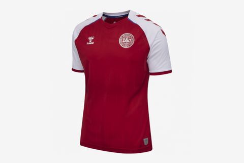
Denmark
Graeme: I swear Denmark has been wearing the same Hummel jersey at major tournaments for the last 20 years. It's almost comforting.
Matt: It's difficult for a grown man of my age to wear a football kit without looking like an idiot, but this is nice.
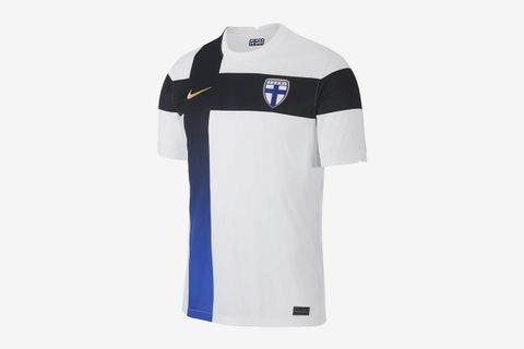
Finland
Graeme: No offense, but why did Nike only go all out design-wise for Finland only. Were they trying to make another Nigeria happen?
Fabian: It's one of the best, for sure.
Belgium
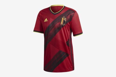
Matt: I don't know what the broad strokes are for. It doesn't mean anything, does it? Also, why is the away kit’s badge in English?
Graeme: They ran a car over the kit but it still ended up looking nice.
Jake: Seriously, what is going on with that stripe of tire treads? It's like a Hot Topic x Belgium print-collab moment.
Russia
Graeme: The away kit has got the Turkey thing going on. Is this a trend with countries ruled by despots or something?
Fabian: It's also the most Russian thing ever to have a huge badge. Right? The badge is five times bigger than it's supposed to be.
Jake: I can't possibly imagine why Putin would be into Tsarist iconography – it's not like he's an imperialist or anything...
Netherlands
Matt: It's so orange. Was it always so orange? I think it's really difficult to wear a Dutch kit unless you're a Dutch fan at a Dutch game.
Graeme: I don't know if I'm into that. The lion thing reminds me of video game merch or something.
Fabian: I think it looks pretty ferocious. I’d rather have a lion on my shirt than no lion on my shirt, to be honest.
England
Fabian: You guys notice the lions here as well? Who do you think would win, the Dutch lion or the English lion?
Matt: If the English lion is Harry Maguire then my bet is on England. But I’m not sure about the blue kit. It also looks like it fits very tight.
Croatia
Matt: A football tournament is always made when the camera goes to the crowd and there's like 10,000 Croats in the red and white check shirts. Classic.
Jake: The louder the print, the closer to God. This is a win in my book.
Poland
Matt: It's weirdly non-symmetrical, and I don't trust it. That aside, it's nice, but perhaps veering too far into golf dad territory.
Portugal
Matt: I don't think Portugal has ever had a bad kit. I always love them. They've probably got the best in the world.
Fabian: Except for this away kit.
France
Graeme: We're kinda used to the French having amazing shirts by this point and take it for granted. Lovely shades of blue, this.
Fabian: I find the away kit looks too much like a pajama top. There's too much white.
Germany
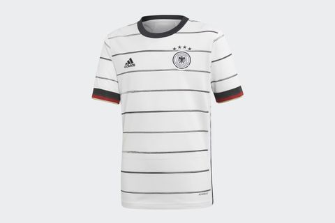
Graeme: Very bad sleeves on the home. I get it's the Germany flag but the red and gold feels too much. Love the away!
Fabian: I do like the simple black and white stripes. I think this is one of Germany's best kits in a while. The away kit in my opinion could have been so sick if adidas didn't use the weird template that separates the shoulders from the torso. The stitching is so out of place.

